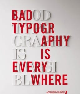
 Many do not view typography as an element of concern when creating presentations or pitch materials because, after all, isn’t content the star? However in a SXSW session I attended, typography evangelist and UX designer, Richard Rutter, proved just how much of an impact typography can have on a user’s experience. He insisted that good typography not only induces a good mood but also increases readability. With typography, even if people don’t consciously care about it, they are affected by it.
A simple example of this: I won 3 trophies and 7 medals vs. I won three trophies and seven medals. Rutter believes numbers should be treated like letters to avoid being “shouty.” Also, just as seen in the photo above, when typography is done right, it is invisible to the audience, but when done poorly it distracts from any content comprehension. This is why Rutter calls typography “the aesthetic of reading.”
Presently, with the transition to mobile being the primary way we receive content, Rutter drove home his point that the visual user-experience needs to be seamless between devices. How many people have read an article on your iPhone then transitioned to your laptop and your experience was completely different? With adding minor CS3 coding elements, such as adding pads to match the line break on an iPhone or columns to eliminate long scrolling pages, the user experience can be ameliorated.
When you are choosing a font, Rutter emphasizes making sure it is part of a font family replete with enough useful weights to allow for versatility. Choosing the right font from a brand’s style guides or from a font database will set the tone for the brand. Rutter suggests when stuck between a few options, create a “specimen” that places the content in various fonts side by side for easy comparison.
So for your next presentation or a web page development project, consider typography as an important element since it is the vehicle that will drive the content home.
Photo credit: scm.ulster.ac.uk


