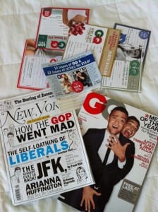
 I recently made a trip home to North Carolina, and prior to catching my flight in New York City, I grabbed a couple magazines for the trip: New York and GQ.
The magazines provided great content, but they also offered up an annoyance that has led to this post.
The annoyance is something that likely drives you crazy as well. Any guesses?
I’m talking about the little subscription inserts that fall out and inevitably get trashed.
New York had a decent amount of inserts, but GQ loaded the magazine down, as you can see by looking at the photo. Yes, those are all GQ inserts, and this subscription tactic, in my opinion, is completely outdated.
I’d like to highlight two ways magazines could potentially evolve the insert process in an effort to . . .
- Increase subscriptions
- Utilize digital
- Reduce costs.
While these two examples pertain to magazines, businesses have to continually think about how they communicate with customers and utilize technology.
Digital Emphasis
I’m a fan of both GQ and New York, but I’ve yet to subscribe to either publication. I typically purchase both when traveling, and as you may have guessed, the subscription inserts have never worked on me.
Let’s think about the complexity of the situation before moving forward.
I purchased the magazines in NYC, flew to NC for several days, and flew back to NYC and eventually unpacked. Now, through all that I’m supposed to keep track of a subscription insert to stick in the mail? Not happening.
What would be great is if those little subscription inserts had a QR code, or website at a minimum (some are starting to list websites on occasion), that would immediately take the customer to a subscription page that pertained to the offer advertised on the insert.
This page should be extremely simple and mobile friendly in an effort to allow for easy navigation and a quick transaction. I’m talking name, address and payment info — kind of simple.
Not to mention that this method could potentially reduce prepaid postage costs in a pretty big way.
Placement
This is a two-part thought that is strategic in nature.
First off, magazines have feature articles publicized on the cover that should, in theory, be some of the best content in that edition. These articles are typically longer and require a bit more of the reader’s time.
Magazines could put the inserts in between the pages where the feature stories end. If a reader makes it to the end of a story and isn’t a subscriber, this is the perfect time to say, “Since you enjoyed that article and aren’t a subscriber, we’d love to give you a great subscription deal.” Make the pitch while interest is high.
Second, why can’t we just ditch the inserts all together? They make people crazy. Or am I alone on that?
Breakthrough thinking would be for magazines to start incorporating them as part of the actual page that feature stories end on. The story could end on the top half of the page, and the insert could take up the bottom half.
This method would allow publications to make the subscription pitch right when feature articles end (when interest is high), and to not allow the chance for the insert to fall out and to not be picked back up. For what it’s worth, I have both magazines sitting on my desk at work, but the inserts went in the trash days ago.
If I saw the second method along with digital integration, I’d be one happy guy.
From a business perspective it can be extremely challenging to shift how you communicate with customers, but it’s a challenge worth taking, especially when it could potentially help move more widgets.


