As if New York didn’t have enough eye candy, last month offered yet another spectacle for lovers of bright colors, bold shapes and caffeinated conversation: the Pictoplasma NYC conference. Now in its 8th year, this U.S. offshoot of Berlin’s sprawling annual Pictoplasma Festival is ostensibly a showcase for practitioners of character design, but its in-depth talks, presentations and screenings offer inspiration and guidance to visual communicators of all stripes – and to the people who work with them.
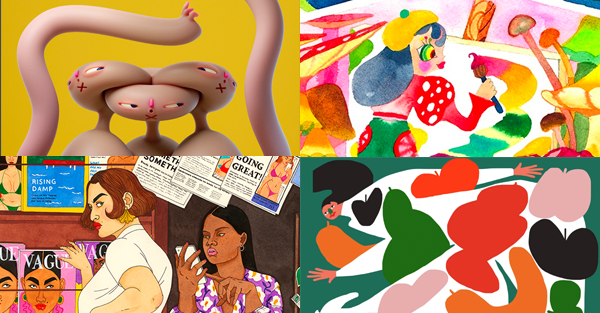
Clockwise from upper left: Untitled Army, Hae Jin Park, Amber Vittoria, Laura Callaghan
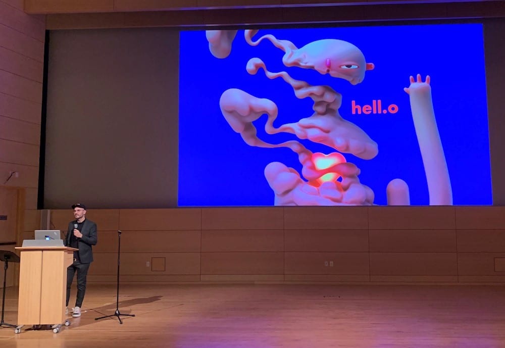
Pictured: Untitled Army
Character Is King
Character design cuts across graphic design, illustration, animation, toymaking and fine art, among other disciplines, but at its heart it reflects the belief that prioritizing characters – be they humans, animals, monsters, or whatever – results in inherently engaging communication. People like looking at people (or things that evoke people), and depicting them visually creates an instant bond of empathy that can enhance any message, commercial or otherwise. And our definition of character can be quite broad – as painter/illustrator Hae Jin Park said, referencing her own personal, passionate visual vocabulary, “Colors can be characters, too.” Imbuing visuals with life and personality – i.e, with character – has as many different forms as there are creators.
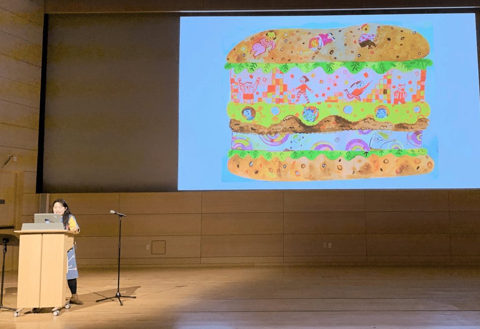
Pictured: Hae Jin Park
Each speaker shared a combination of personal and commercial work, and most of the time, it was impossible to tell the difference. This is by design – nearly every presentation extolled the virtues of setting aside time for personal creative development, which fuels the evolution of their work for clients. Illustrator/animation director Lucas Camargo (who works under the moniker Untitled Army) recommended finding the sweet spot each day when you’re most creative (for him it’s first thing in the morning) and defending that vigorously; illustrator Laura Callaghan puts aside a certain period every year for a deeper dive into personal work between professional projects. Either way, the focus benefits the creator, by providing freedom to explore, and their employers, by making them beneficiaries of new and improved styles and skills. It’s a win-win!
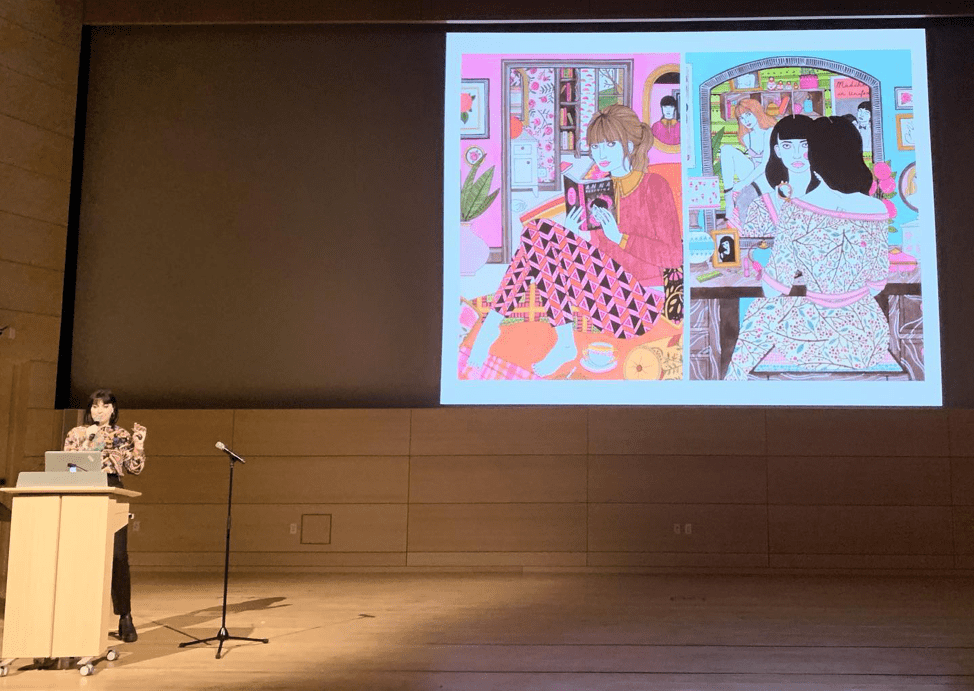
Pictured: Laura Callaghan
Don’t Sweat Your Style
One of the consistent throughlines at this year’s Pictoplasma was the idea of personal style. On the one hand, art directors look for freelance illustrators to provide a predictable product; on the other, creators need to be able to grow and evolve. Despite the commercial practicality of an easily recognizable style, several speakers were defiant in their defense of freedom. “If you make something, it is in your style,” said illustrator Amber Vittoria, arguing the work speaks for itself, however it looks. Camargo provided an even more poetic dismissal, saying “Style is a fossil of what you leave behind you.” Instead, he urged focusing on “the language before the language,” the power and meaning of the message you’re trying to convey – as communicators, we need to serve that directive first and foremost, and the style needs to follow it.
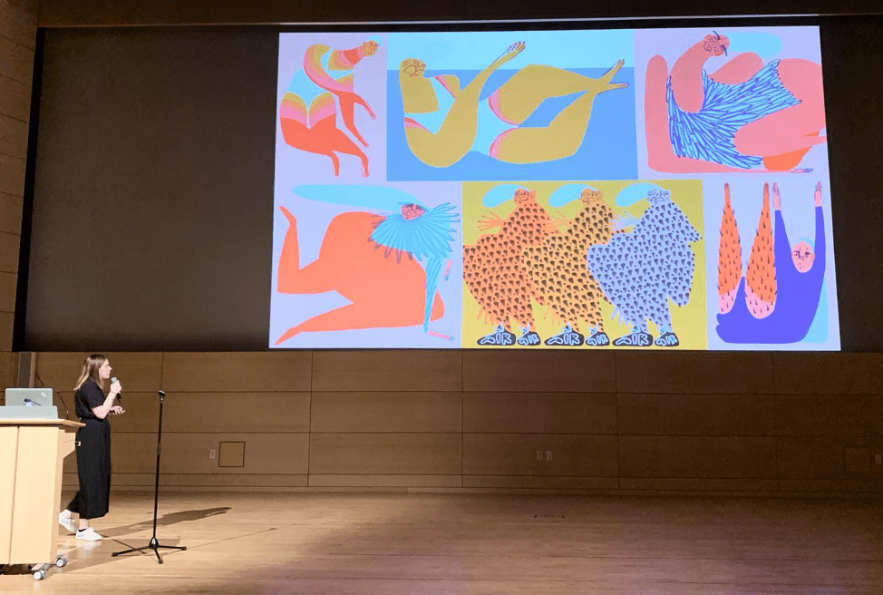
Pictured: Amber Vittoria
Don’t Be Afraid of Fear
Laura Callaghan told a story about her first time being hired to paint a mural – arriving at the venue, she realized with terror that it was much larger than she’d expected, requiring leaning off a tall scaffold to paint. After a steep learning curve, including bouts with vertigo, she came out the other end eager to do it again. Fear can be a great creative motivator, so accept new challenges that come your way, even if you don’t know how they will work out. Digital illustrator/animator Alex Kiesling echoed this sentiment when he spoke about making the leap from 2D to 3D design without knowing what it would entail: “Just download the software and start,” and let the fear fuel your journey through the unknown into something new and exciting.
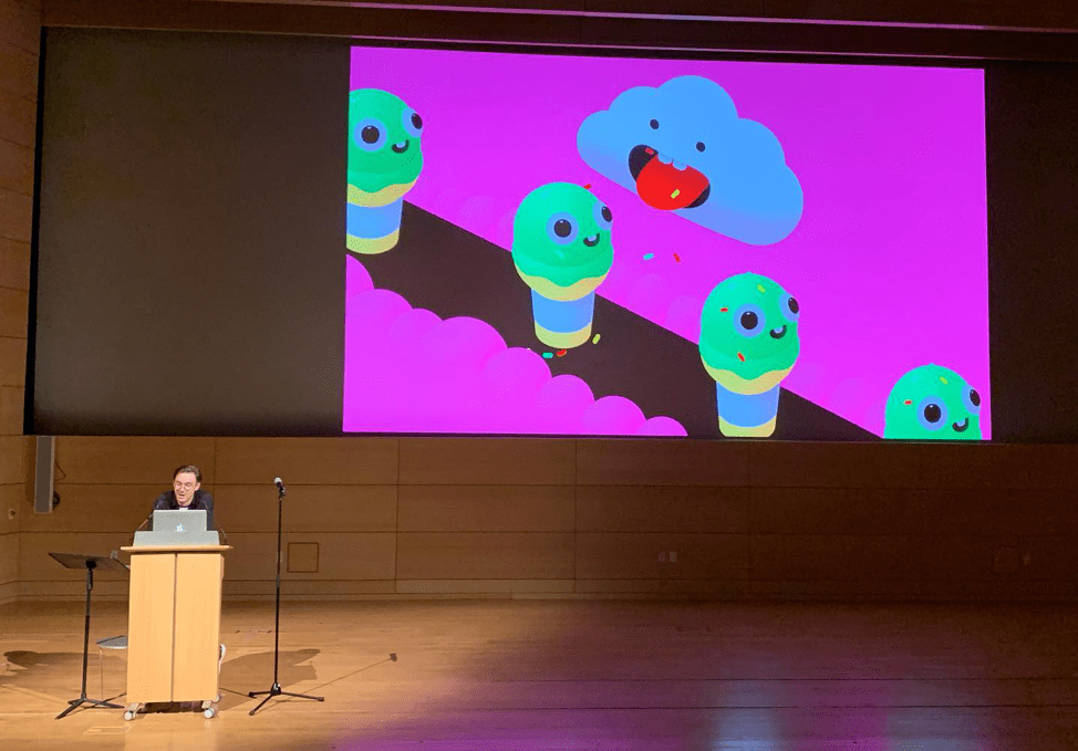
Pictured: Alex Kiesling
Embrace the Glitch
Another artist who advocated just jumping in was animation director Nikita Diakur, who described how his debut film, Ugly, stemmed from his interest in using tools he’d never tried before. The process began by making something intentionally ugly, with all of the seams showing, an approach that gradually blossomed into a unique style of its own. In the end, the very limitations of his skill with the software led to something completely original. On the analog end of the spectrum, Hae Jin Park leans into the inherent unpredictability of watercolor as a medium, often resulting in exciting looks and textures she could never have predicted if she hadn’t been open to happy accidents.
The world of visual culture is vast, and each Pictoplasma presenter occupies their own every-fluctuating territory within it. If today’s cultures and industries are in a constant state of change, we can all take a cue from artists like these to keep our eyes and minds open for new possibilities to communicate with each other.
